top of page

Look at sketchbook for more detail on ideas that concluded to this design.
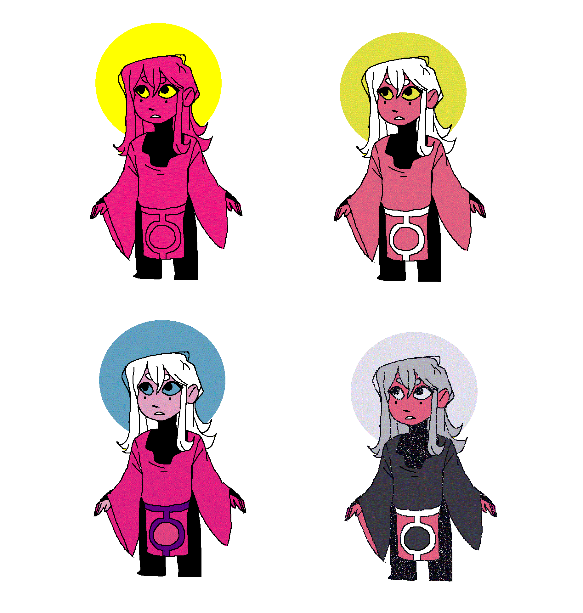
After sketching many ideas I decided on a final outcome for the character that I was happy with. I did some color palette examples that I thought were best for contrast and help the character stand out in a unique way expressing their personality. I came up with four different color sets. The first one being three simple and bright, the second was four, similar to the first one but was more tame with the addition of white. The third one, I was starting to think or moon like colors which is more noticeable in the last color example. How I did this digitally was, I had my sketchbook by me for reference of what the character looked like and I drew a rough sketch on MS paint, once happy I outlined it. I added the halo (circle at the back of the head) to symbolize that her characters shape is circular and that she is a character inspired by the moon.

Once I finally decided on the colour palette i moved towards a complete profile for the character so I can plan out measurements for the next stage which would be 3D or other different experiments of the character. Both color and just sketch so I have a reference for then I draw the character in figure and situations that would be important to the story.


Here I started to look at the final outcome of the character design I had used and started to think of parts and areas I disliked about it or thought and knew would be a huge issue throughout the experimental stage. In one of my ideas for the character I had sketched down a personalized looking face and I added it to the look and right away it gave the overall look a better presentation. It made the character more childish which is just what I wanted.

Landscape
For the visual story, I'll need a setting and I choose the setting of a forest/ woods. I took images of trees around where I live and did the digital observational drawing. With each image, I tried to make it something more cartoonish and not so realistic. The first Image I drew on Illustrator program and passed the image through a progress of shading and colour lighting to set a tone. I liked the mood the warm colours gave the setting so I simplified it more


I tried experimenting with presentation of a prologue/ prologue page as it is the first thing the audience will see. It will be the first impression on the story. A welcoming that will overall let the audience interpirate the story.


I tried experimenting with softer colours to make the contrast between the visual and the actual themes and story to have a larger effect. The last image was to see how the main character would fit with the background and it seemed like a success but the image was a rushed one and had errors such as the way the character is running is incorrect.

I sketched out a running figure that would be anatomically accurate and then outlined, added colour and did two parts, the original planned one vs the line less one which would seamlessly blend in with the background.


The first image where I tried to blend the background and the character image together I ended up making the character too light and blend too well into the background which ended up with the character being undetected (hard to make out making the journey hard to follow) So I redid it to make the character stand out more while still having it blend well into the background.
At this point I think I have found a style found a style. How i managed this was overlaying colours to make the image seem flat with little to no gradation. (a popular illustration technique that is rather popular in today's art industry.)
I want to push a few more visual ideas just before starting the main story board that will lead to the visual story.

This is to see how the character would run related to their personality: which is built around curiosity and fear. Her running would either be slow and cautious to take in the surroundings or fast and reckless to get away from any danger. I want to do movement examples for all of the characters for the story as there being little no no words being exchanged I will have to rely heavily on body language interactions to show the characters personalities.

(see character design development in sketchbook/ A1 sheet) This crow humanoid character running style would reflect his personality with barbaric and ruthless movements. In the image above he is lacking it and I will try moving his body closer to the ground to bring more speed as well as his body should be in a more cartoon sprint. I want this character to seem scary but is far from that as i inspire the character to just be an appearance that scars the main character. I think with the simple colour and shape the character will be memorable.

Rough size scale of the characters to demonstrate the difference and will also be references when working on the actual main visual story.
The original intentions was for this character to be stages 2 and 3 of fear being both the monster and death relating the character to the crow design. But with the changes of this character only being stage 2, the monster leaving the whole design of the crow being left to foreshadowing as the symbolic image of the character does represent death.

The image on the right is a concept image of what the monster would do to the main character/rabbit a rough idea of character interactions. This also brings on the idea that the crow monster will be followed around by crows to make it clear on what he is also making the death at the end more significant with the foreshadowing.
The image was roughly planned which lead to errors such as the planned high difference and the face of the monster. With the monster's face only appearing at the side in all angles it is difficult to adjust it to situations. but the idea I will still keep as it is as the stylized effect of a 2D overlapped platform would fit into the popular fit of a children's story.
bottom of page